Let’s try plotting the spread of the Novel Coronavirus, COVID-19 in the United States as a function of time for the month of March. Let’s first read the data. The data can be downloaded from this link. Note that these numbers come from the European CDC.
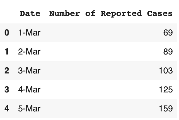
Once we have our data, let’s read it and store it as a pandas data frame.
import pandas as pd

dataframe = pd.read_csv(r'covid-19-usa.csv')

dataframe.head()
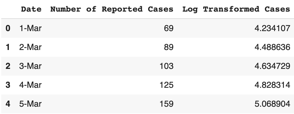
This data is originally on a linear scale, but in order to gain more insights into the data, we should also log-transform it.
dataframe['Log Transformed Cases'] = np.log(dataframe['Number of Reported Cases'])

dataframe.head()
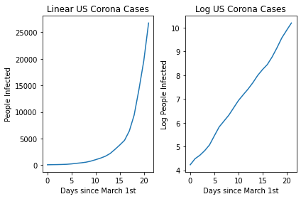
Now let’s try to plot this initial data. We can do this both on a linear and a log scale.
fig, (ax1, ax2) = plt.subplots(1, 2)

x = np.arange(0 , 22)
nparray = np.asarray(dataframe)
y_lin = nparray[:, 1]
y_log = nparray[: ,2]


fig.tight_layout()

ax1.plot(x, y_lin)
ax1.set_title("Linear US Corona Cases")
ax1.set_ylabel("People Infected")
ax2.plot(x, y_log)
ax2.set_title("Log US Corona Cases")
ax2.set_ylabel("Log People Infected")
ax1.set_xlabel("Days since March 1st")
ax2.set_xlabel("Days since March 1st")
fig.tight_layout()
You can see the linear nature of the log transformed version! This then allows us to easily plot a line of best fit using a linear regression and then make predictions related to the expected spread in the future!
y_log = np.asarray(y_log , dtype='float')


slope, intercept, r_value, p_value, std_err = stats.linregress(x, y_log)


plt.plot(x , y_log ,'o')
plt.plot(x , x*slope + intercept)

print("R-Value: " , r_value)
R-Value: 0.9986131784823458
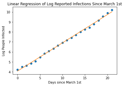
With an R-Value of 0.99 , we have a pretty great fit on our data. Now, let’s use our equation to continue plotting, let’s say 12 weeks, that is about 30 days since March 1st. Let’s calculate the log of the number of people infected and then back-calculated the linear value to get the actual number of predicted infected people.
import math
x = np.arange(30)

plt.plot(x , x*slope + intercept , color='orange')
plt.xlabel('Days since March 1st')
plt.ylabel('Log People Infected')
plt.title('Linear Regression of Log Reported Infections Since March 1st')


log_day_30 = 30*slope + intercept
print('Log of Infected People at Day 30 is: ' , log_day_30)

actual_day_30 = math.exp(log_day_30)
print('Predicted Number of people at Day 30 is: ' , actual_day_30)
Log of Infected People at Day 30 is:  12.571979810833458
Predicted Number of people at Day 30 is:  288364.27707805636
slope:  0.2834376040667911
intercept:  4.068851688829726
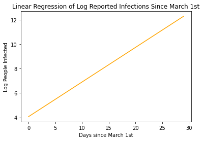
Our model states that by the end of March, More than 280,000 are predicted to be infected with COVID-19! That’s Crazy!!!
We can think of the linear equation $y_{transform} = mx + b$ as actually being equivalent to $log(P_{actual}(t)) = log(b)t + log(P_0)$
Where $t$ is time, $b$ is the growth rate $P_{actual}(t)$ is the actual number of people infected at time $t$, and $P_0$ is the initial number of people infected at March 1st. So in this
In reality, our model is more likely to be a logistic growth model rather than an exponential growth model as there is an upper bound to the number of people who will be infected.
We can model the spread of the virus even better by appreciating the logistic function.
$f(x) = \frac{L}{1 + ae^{-bx}}$
Another way of stating this is:
$P(x) = \frac{L}{1+ P_0e^{-bx}}$
Having more accurate information about both the growth rate $b$ and the carrying capacity $L$ can help us generate more accurate models.