Why Make Plots?
Making plots helps us as researchers, engineers, and developers communicate data and information. They can help us to process information, gain new insights, and recognize patterns in mountains of numbers.
In this lesson, we will focus on making three different types of plots:
- Continuous Plots
- Bar Plots
- Plots from Equations
Continuous Plots
Scatter plots are great when we have raw data points that we want to plot. There is no unique function that we can use to make discrete points continuous lines, but we can work with these plots to make lines of best fit and other predictions.
We will break down the process of making plots into two steps. The first step is to read the data into a suitable structure in python. The second step is to actually plot it. For this tutorial, we will be plotting a ECG reading from a 12-Lead ECG. You can download the ECG file here. Once you have downloaded the file, make sure to place it in the same directory as your .py or .ipynb file where you are writing your code.
Follow this code to read the file and then store it into numpy array:
#Import libraries
from scipy.io import loadmat
import numpy as np

#Read file
filename = 'A0001.mat'
reading = loadmat(filename)
data = np.asarray(reading['val'], dtype=np.float64)
print(data.shape)
print(data)
(12, 7500)
[[  28.   39.   45. ...  258.  259.  259.]
 [   7.   11.   15. ...  248.  249.  250.]
 [ -21.  -28.  -30. ...  -10.  -10.   -9.]
 ...
 [-112. -110. -108. ...  194.  194.  195.]
 [-596. -590. -582. ...  307.  307.  307.]
 [ -16.   -7.    2. ...  213.  214.  214.]]
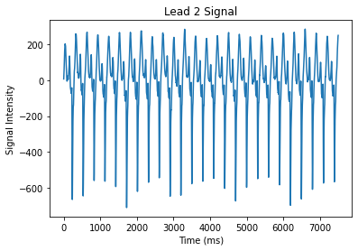
You will see that we have multiple arrays. In fact, we have 12 arrays that are each 7500 units long. This means that we have 12 different ECG leads, and each of them have 7500 time steps. Let’s first try to plot only one lead. Follow this code snippet:
import matplotlib.pyplot as plt

x = np.arange(data.shape[1])
y = data[0]

plt.plot(x , y)

plt.xlabel("Time (ms)")
plt.ylabel("Signal Intensity")
plt.title("Lead 1 Signal")
plt.show()
Great! We can also zoom into the plot to see more details. We can just change the axes of the plot
limit = 4000
x = np.arange(limit)
y = data[1][0:limit]

plt.plot(x , y)
plt.xlabel("Time (ms)")
plt.ylabel("Signal Intensity")
plt.title("Lead 1 Signal")
plt.show()
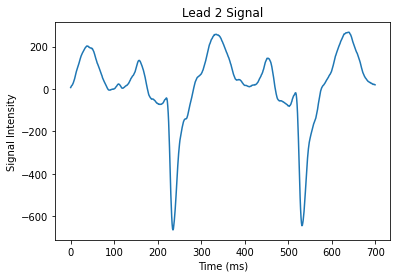
This data doesn’t look like a normal ECG signal with its characteristic PQRST wave. This is because this data comes from a patient with a condition called a Right Bundle Branch Block. Essentially, this patient has a block in their heart that causes them to have an altered signal.
Great! Plotting the data helps us to visualize what’s exactly wrong with this patient’s heart!
Bar Plots
Bar plots are helpful when we have categorical data. Instead of downloading and reading a file to plot, let’s try creating our own data. Let’s create a dataset related to the demographics of patients in a clinic.
Follow the code below to create some data related to the number of patients of certain demographics in our clinic:
x = np.arange(4)
ethnicities = ('African American' , 'Asian' , 'Hispanic' , 'White')
patientNumbers = [68 , 56 , 44 , 89]

plt.bar(x , patientNumbers , color='pink')
plt.xticks(x , ethnicities)

plt.title("Number of Patients at Clinic in 1 week")
plt.xlabel("Number of Patients")
plt.ylabel("Ethnicity")
plt.show()
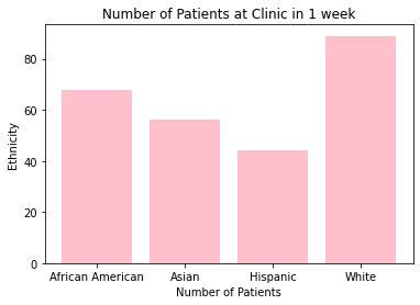
Wow, look at that , we can even add custom colors by changing the color= paramater!
Plots from Equations - COVID-19
What if we already have a predefined equation that we want to plot? Again this can easily be plotted with the matplotlib library of python.
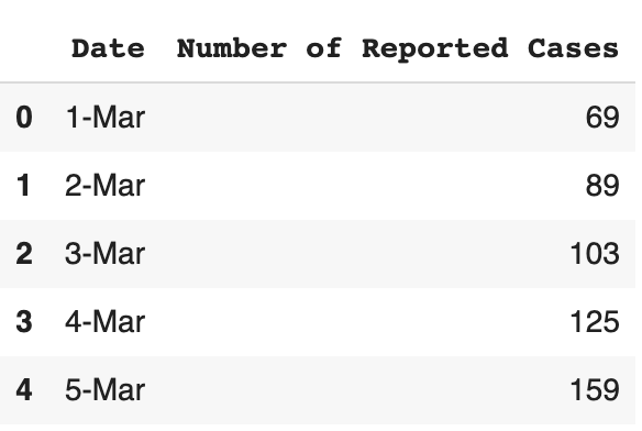
Let’s say I want to plot a cost function that relates the total revenue of my clinic as a function of the number of patients I see. Let’s try plotting the spread of the Novel Coronavirus, COVID-19 in the United States as a function of time for the month of March. Let’s first read the data. The data can be downloaded from this link. Note that these numbers come from the European CDC.
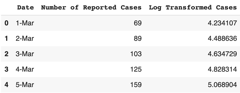
Once we have our data, let’s read it and store it as a pandas data frame.
import pandas as pd

dataframe = pd.read_csv(r'covid-19-usa.csv')

dataframe.head()
This data is originally on a linear scale, but in order to gain more insights into the data, we should also log-transform it.
dataframe['Log Transformed Cases'] = np.log(dataframe['Number of Reported Cases'])

dataframe.head()
Now let’s try to plot this initial data. We can do this both on a linear and a log scale.
fig, (ax1, ax2) = plt.subplots(1, 2)

x = np.arange(0 , 22)
nparray = np.asarray(dataframe)
y_lin = nparray[:, 1]
y_log = nparray[: ,2]


fig.tight_layout()

ax1.plot(x, y_lin)
ax1.set_title("Linear US Corona Cases")
ax1.set_ylabel("People Infected")
ax2.plot(x, y_log)
ax2.set_title("Log US Corona Cases")
ax2.set_ylabel("Log People Infected")
ax1.set_xlabel("Days since March 1st")
ax2.set_xlabel("Days since March 1st")
fig.tight_layout()
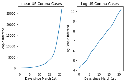
You can see the linear nature of the log transformed version! This then allows us to easily plot a line of best fit using a linear regression and then make predictions related to the expected spread in the future!
y_log = np.asarray(y_log , dtype='float')


slope, intercept, r_value, p_value, std_err = stats.linregress(x, y_log)


plt.plot(x , y_log ,'o')
plt.plot(x , x*slope + intercept)

print("R-Value: " , r_value)
R-Value: 0.9986131784823458
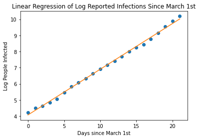
With an R-Value of 0.99 , we have a pretty great fit on our data. Now, let’s use our equation to continue plotting, let’s say 12 weeks, that is about 30 days since March 1st. Let’s calculate the log of the number of people infected and then back-calculated the linear value to get the actual number of predicted infected people.
import math
x = np.arange(30)

plt.plot(x , x*slope + intercept , color='orange')
plt.xlabel('Days since March 1st')
plt.ylabel('Log People Infected')
plt.title('Linear Regression of Log Reported Infections Since March 1st')


log_day_30 = 30*slope + intercept
print('Log of Infected People at Day 30 is: ' , log_day_30)

actual_day_30 = math.exp(log_day_30)
print('Predicted Number of people at Day 30 is: ' , actual_day_30)
Log of Infected People at Day 30 is:  12.571979810833458
Predicted Number of people at Day 30 is:  288364.27707805636
slope:  0.2834376040667911
intercept:  4.068851688829726
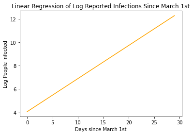
Our model states that by the end of March, More than 280,000 are predicted to be infected with COVID-19! That’s Crazy!!!
We can think of the linear equation $y_{transform} = mx + b$ as actually being equivalent to $log(P_{actual}(t)) = log(b)t + log(P_0)$
Where $t$ is time, $b$ is the growth rate $P_{actual}(t)$ is the actual number of people infected at time $t$, and $P_0$ is the initial number of people infected at March 1st. So in this
In reality, our model is more likely to be a logistic growth model rather than an exponential growth model as there is an upper bound to the number of people who will be infected.
We can model the spread of the virus even better by appreciating the logistic function.
$f(x) = \frac{L}{1 + ae^{-bx}}$
From our prior exponential model, we can estimate the logistic model by:
$P(x) = \frac{L}{1+ P_0e^{-bx}}$
Having more accurate information about both the growth rate $b$ and the carrying capacity $L$ can help us generate more accurate models.